Scanning a QR code from an event poster can work. I understand that. I don’t understand why providing a URL in clear text has gotten a bad reputation.
Clear text, readable by humans, is more cyber secure (no need to trust “click me” when you can’t even see the URL). It’s more versatile. It’s more robust. And it works when presented on a briefing slide. In briefings or meetings without a cell phone to snap images, the audience can write down the text-based contact info they need.
It’s really frustrating to be confronted with a tiny graphic on a contact information slide in a presentation that is on a screen 150 feet from where I’m sitting. A QRC uses more visual real estate than text, is graphically gaudy, and can’t be integrated well with the rest of the text information that is on the flyer.
I guess it’s just me. Yea, I know. QRCs are cool…

 99% of ICOs Will Fail
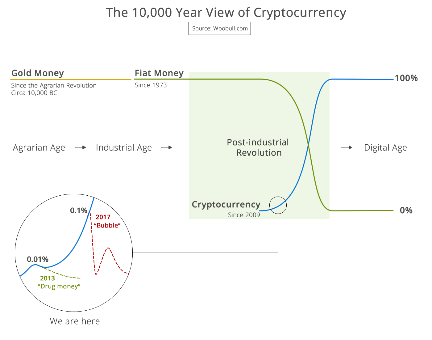
 The 10,000 year view of cryptocurrency