
I stumbled across a financial display at morningstar.com that shows overall mutual fund behavior. It struck me as particularly pleasant and intuitive. If you visit their page, you can hover your mouse over different squares to get more information.
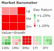
I’m not sure the information is as dense as can be. For example, there are certain graphical elements that could be encoded with more information, such as the shape of the square blocks. However, overall, I really like it. I’m trying to think of such visual tools for communicating about stock options. Any ideas?
BTW, Mr. Tufte wrote a book with a similar title, Visual Display of Quantitative Information. After decades of science, engineering, education, and operations, it is my top recommended non-fiction book toward technical excellence.
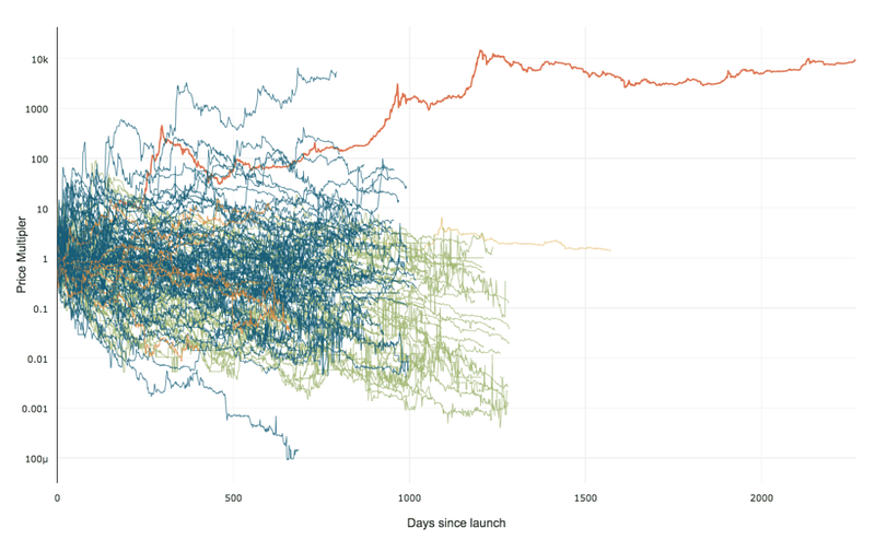 99% of ICOs Will Fail
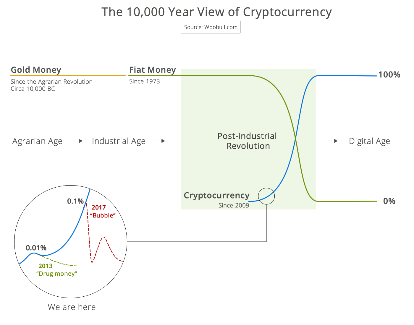 The 10,000 year view of cryptocurrency